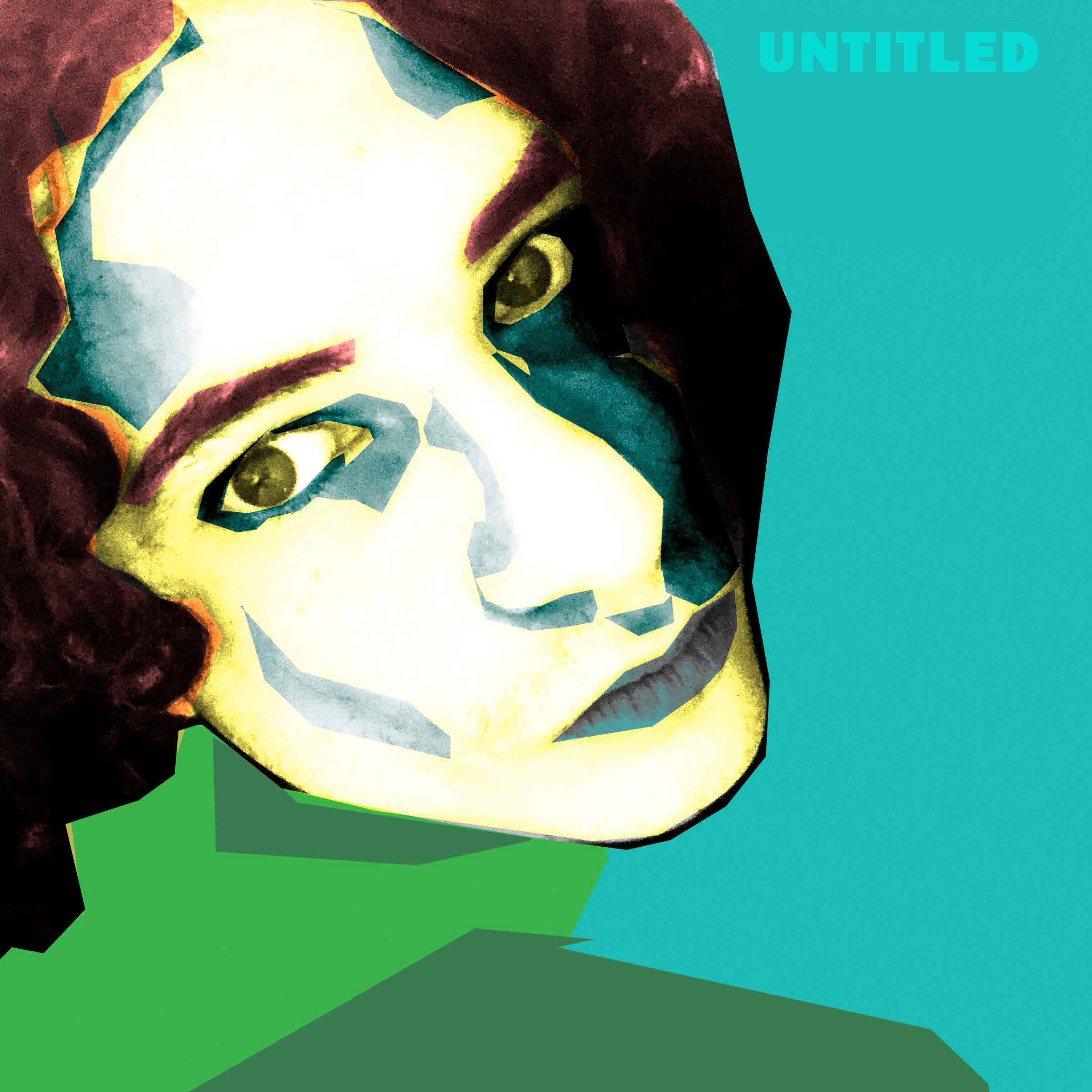
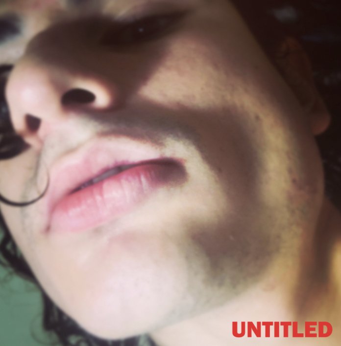
Untitled, album design, 2020
Objective: Design the brand identity and campaign for Qveery’s album “Untitled’.
Approach:
The first step in designing for “Untitled” was creating compositions that embodied the album’s themes of art history references, queerness, and vulnerability. The little artworks would lead to creating the overall album cover.
Compositions
I looked through the lyrics, many of them referenced Art History. Lyrics that brought up “Jackson Pollock”, “Andy Warhol”, and some tracks strictly were based around vernacular associated among art students. I took this and made concepts using different materials such as silk screen, ink, photo collaging, and photography as a way to discover an identity. I was able to form the identity and look from doing this.
Album Cover iterations
Choosing the album cover was tough at first, I had two photos that I was drawn to from the compositions earlier. Using those photos, I tried out different versions of each, either way, I knew I’d use them in the identity.
Actual Album Cover
For the main LP cover, I went with the avant garde photograph of a wet head looking up. This is a metaphor for the vulnerable coming of age story that the album entails to. I used colors that felt muted, but natural. This was juxtaposed with saturated and solid colors to bring listeners into the world of Qveery.
The other image of the head with the solid background would be used for the actual cd. Instead of being a solid background, it would be duplicated with different colors behind one another.
Booklet
For the booklet, I wanted it to be a mix of artistic mediums as well. I tried to have the typography have a complex grid system, but feel light an airy. Using a baseline grid, I was able to position text freely, and have the compositions feel as if they were speaking for themselves.


